At DH Bags, we spend every day on the production floor translating design concepts into finished products. Here is what our team is observing across international brand orders this year—straight from the factory floor to your product development desk.
The Big Picture: Two Color Directions
This season, the backpack market is splitting into two distinct color strategies based on age demographic:
- Younger students (early-grade / kids): Soft, muted palettes dominate. Think cloud whites, powder pinks, mint greens, and baby blues.
- Older students & teens: A partial return to high-saturation statement colors for bold self-expression.
1. Pantone Color of the Year 2026: Cloud Dancer
Pantone has named Cloud Dancer its 2026 Color of the Year—a luminous, silk-gloss cloud white that feels airy, clean, and effortlessly modern.
In backpack design, this has translated into an entire family of pastel derivatives: dusty rose, seafoam, pale lavender, and soft buttercream. These tones offer more visual depth than stark white while maintaining that same sense of clarity and calm.
Why it works for bags: Cloud Dancer and its pastel extensions photograph beautifully, feel premium without looking overpriced, and appeal to parents buying for younger children as well as teens shopping for themselves.
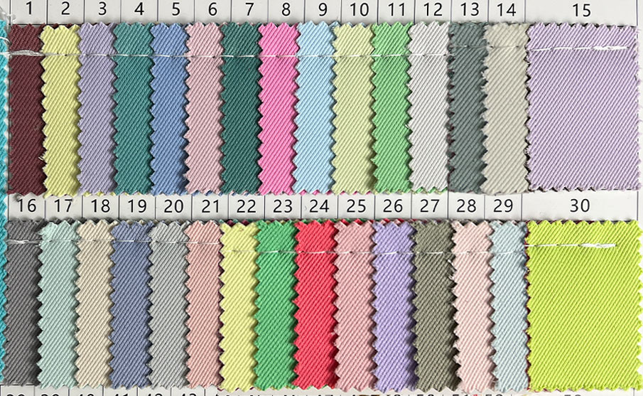
2. The Bold Return: Cobalt Blue & Bright Orange
- Cobalt Blue (Cobalto Pop) — Often called “Yves Klein Blue,” this intense, electric blue acts as a neutral-with-attitude. It pairs with almost any outfit while still commanding attention.
- Bright Orange — A direct injection of energy. After seasons of muted minimalism, orange is reappearing on runways and in streetwear, and backpack brands are following suit.
Not every brand is playing it safe. For upper-age and fashion-forward lines, two high-saturation hues are making a strong comeback:
These colors function best as hero SKUs—limited-run statement pieces that anchor a collection and drive social-media visibility.
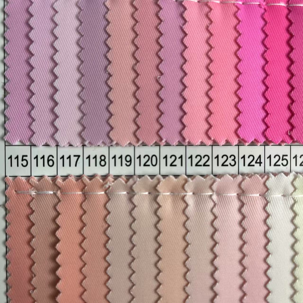
3. Why Pastel & Matte “Candy” Colors Are Winning on the Factory Floor
This year, nearly every major brand in our order book has leaned into matte-finish pastel colorways—what the market calls “matte candy” tones. Here is why this trend is sticking from both a design and manufacturing standpoint:
A. Natural Extension of the Annual Color
Cloud Dancer’s soft, diffused quality makes pastel the logical next step. Brands are building full collections around 4–6 coordinated pastel tones that feel harmonious rather than random.
B. Real Manufacturing Advantages of Matte Finishes
As a manufacturer, we see three practical benefits that brands may not always articulate—but definitely benefit from:
| Advantage | What It Means for Production |
| Scratch Concealment | Matte PU and coated nylons hide micro-scuffs and pressure marks far better than high-gloss surfaces, improving first-quality yield rates. |
| Tactile Upgrade | Matte rubberized or matte-nylon finishes deliver a “soft-touch,” skin-friendly hand feel that consumers describe as “plush” or “cushiony”—a clear perceived-value win. |
| Photography & E-Commerce | Low-sheen pastels do not blow out under studio lights or create harsh reflections. The result: cleaner product photography, fewer retouching hours, and stronger conversion on digital shelves. |
C. Demographic Versatility
Pastel is one of the few color families that genuinely crosses age and gender lines. A single dusty mint or pale peach SKU can sell to elementary students, high-schoolers, and young professionals alike. That SKU efficiency matters when brands are trying to minimize inventory risk.
D. Outfit Compatibility
These colors align perfectly with the ongoing “Clean Fit” and “Athflow” fashion movements. Consumers want one bag that works with five outfits, not five bags for five outfits. Pastel tones make that easy.
4. Product Development Tip: Micro-Differentiation
If you are developing a new backpack line for 2026/2027, riding the pastel wave is smart—but blending in is not. Here are two micro-differentiation strategies we are executing for clients right now:
- Tone-on-Tone Contrast
Keep the body in matte pastel, but add glossy monochromatic logo patches, zipper pulls, or cord ends. The subtle sheen shift catches light without breaking the monochrome calm. - Dusty Pastel (Vintage-Washed)
Introduce a whisper of gray or beige into the base pastel dye. The result is a “lived-in” color that feels nostalgic and premium—distinct from the bubble-gum brights already flooding the market.
Ready to Develop Your Backpack Collection?
Color is only the beginning. If you need fabric swatches, Pantone-matched material cards, or production-ready samples in any of the tones above, our product development team is ready to support you.
Contact us today to request color cards or schedule a sample review.
Last updated: May 2026
Category: Industry Insights / DH Bag Product Development